Editor Tour
A guided walk through every region of the editor shell.
The Volux editor is a single docked window: a tool rail on the left, the live preview stage in the middle, and context panels on the right, with a header strip across the top. This tour walks each region, so the rest of the docs can name them without pictures.
The shell at a glance
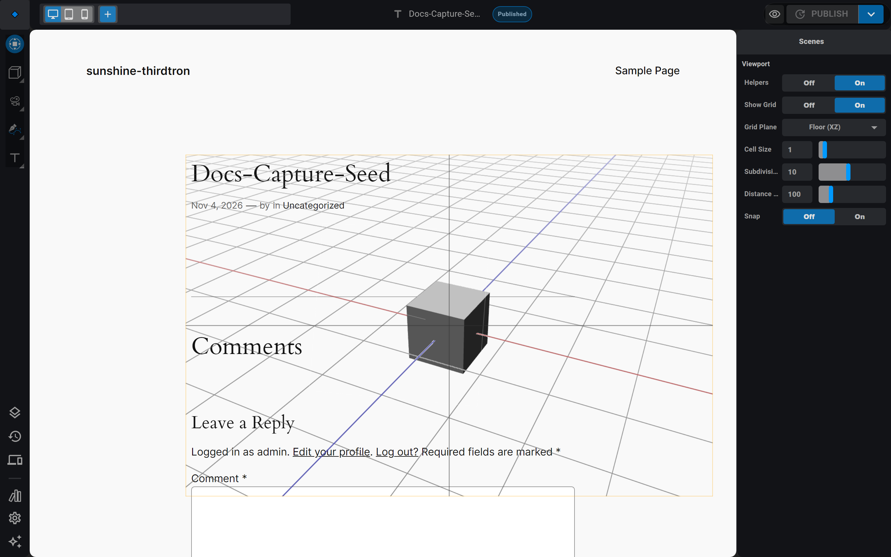
Reading the regions left to right:
- Left rail — the logo, the tool column, and the settings group at its bottom. Panels open in a drawer floating beside the rail.
- Header — document controls: the main menu, the document name and status, the responsive band switcher, and Preview / PUBLISH.
- Preview stage — the live render of your page with its scenes on top; the floating gizmo nav pill rides the stage's bottom edge.
- Right sidebar — the settings panel for whatever is selected, plus a floating event editor when you are editing one.
- Timeline dock — collapsed by default under the stage; open it with Timeline in the rail's settings group.
The header
The header strip spans everything right of the rail:
- Main menu — the diamond logo button at the far left opens the main menu.
- Document name and status — centered; the pill beside it shows the publish state.
- Responsive bands — the desktop / tablet / phone segmented control and the + button to add a band. Bands are how you tailor layout per device; see Responsive Breakpoints.
- Preview (the eye icon) — saves and opens the page the way visitors see it.
- PUBLISH — the split button: publish or update the document; the arrow holds Save Draft and Save as Template.
The left rail
The rail holds two stacks of buttons:
- Tools (top) — Transform, Primitives (box, sphere, cylinder, and friends), Objects (lights, camera, HTML), Curves, and Typography (text and mesh text). Multi-tool groups open a flyout; picking an entry adds that object to the active scene.
- Settings (bottom) — Structure (the scenes tree and DOM tree), History (undo states), Responsive (band settings), Library (assets), Page settings, and the AI Builder.
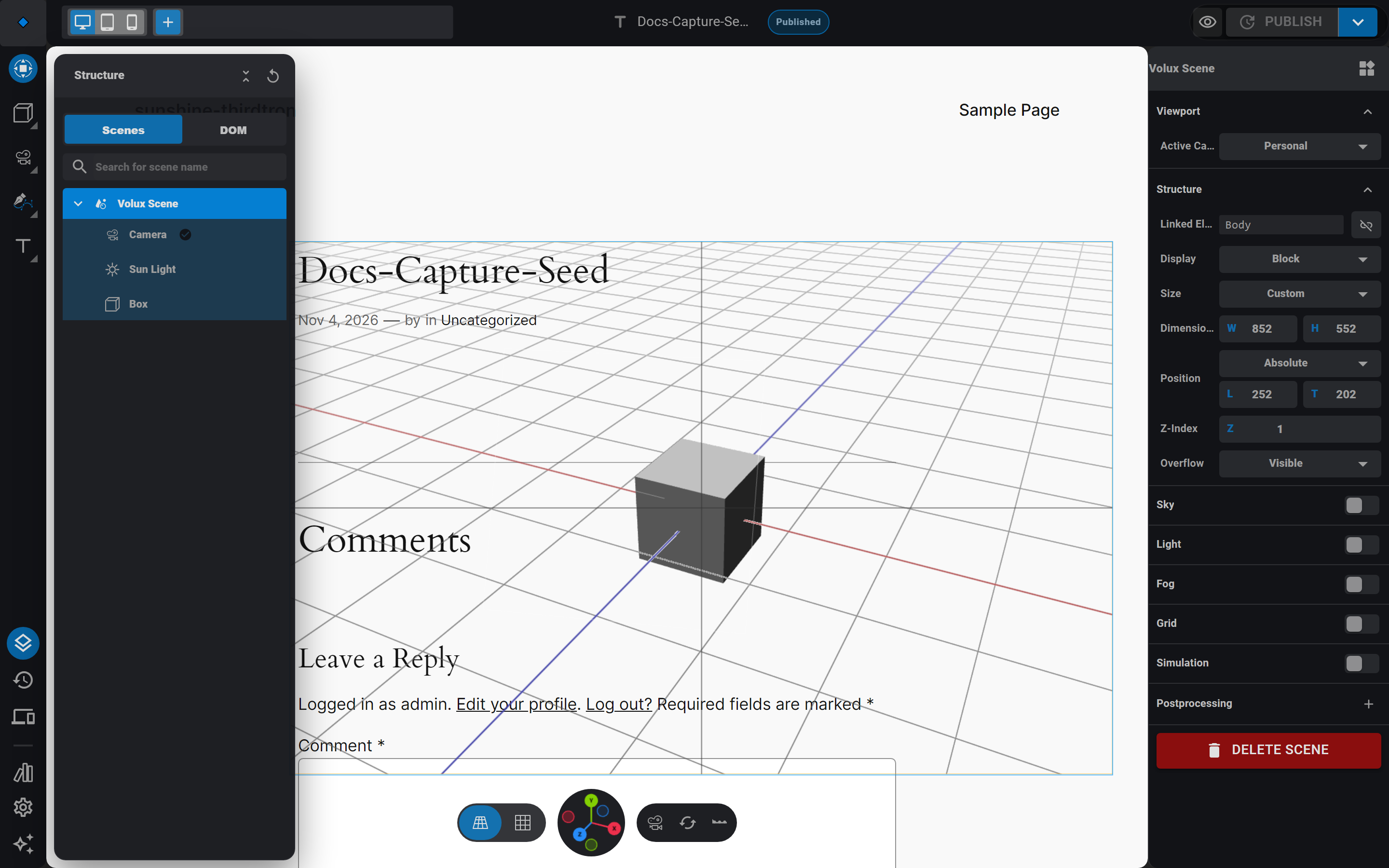
Clicking Structure opens a drawer beside the rail with the scene tree: scenes, their cameras, lights, and objects, plus a DOM tab for the page's own elements.
The preview stage
The stage is a live view of the published page — real DOM content, with each scene rendered on top. You navigate it like a 3D viewport: drag to orbit, scroll to zoom.
- Gizmo nav — the pill floating at the stage's bottom edge: projection toggles on the left, the orientation gizmo in the middle (drag it to rotate the view), and three buttons on the right — swap between the scene's default and the personal camera, reset the view, and toggle the timeline dock. To frame a selected object, right-click it in the viewport and choose Frame Selected.
- Selection gizmo — selecting an object shows its move/scale/rotate handles. Transform in the rail toggles the gizmo on and off; pick Translate / Rotate / Scale from the header's Tools menu, or press G / R / S.
- Timeline dock — press Timeline in the rail to dock the timeline under the stage; it resizes the preview, it never covers it.
The right sidebar
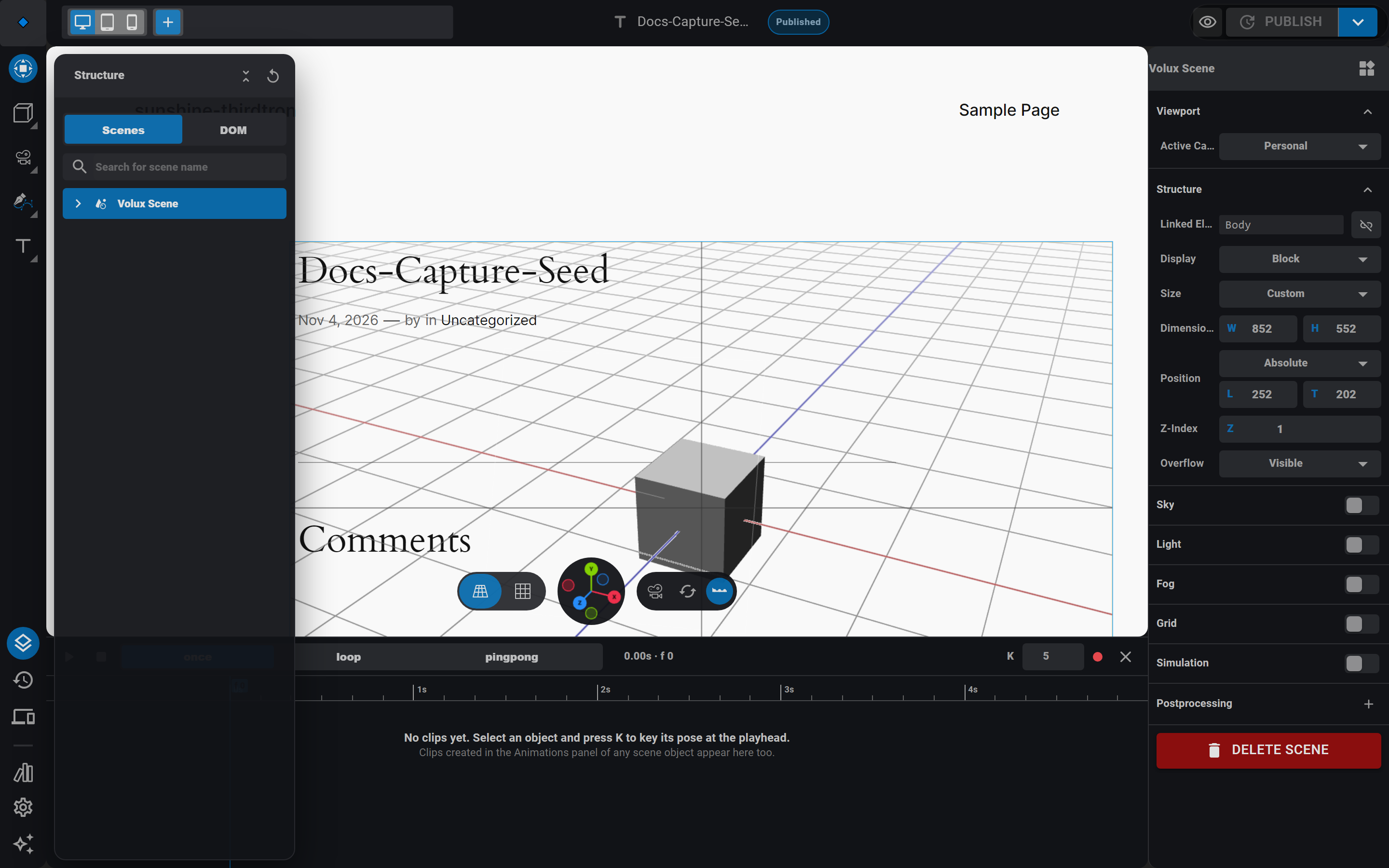
Whatever you select owns the sidebar:
- Nothing selected — the Scenes panel: scene-wide viewport helpers (grid, floor, snap) and per-scene preferences.
- A scene selected — the Scene panel: active camera, the Structure section (display, size, position, and the Linked element pick), sky, light, fog, grid, simulation, and postprocessing.
- An object selected — the Object panel: states, events, transform, visibility, shape, material layers, constraints, animations, and modifiers.
- A page element selected (via the DOM tab) — the Element panel with its states and events.
- Several objects selected — a multi-object panel for the shared properties.
A second, draggable event editor floats beside the sidebar while you edit an event's actions.
Selection and hover affordances
Hovering works in both directions: hover an object in the viewport and its structure-tree row lights up; hover the row and the object is outlined in the viewport. Click selects — the gizmo appears and the sidebar switches to that object. Shift-click (or Shift-drag a box around several objects) extends the selection, and the panel adapts to multiple objects.
Keyboard teaser
The editor is keyboard-first where it counts: V returns to the transform tool, G / S / R grab move / scale / rotate on the selection, Tab toggles mesh edit mode, and Escape backs out of anything. The full table lives in Keyboard Shortcuts.
Next
- Documents & Scenes — the model behind the shell.
- 3D Objects & Mesh Editing — put the rail and the gizmos to work.
Quick Start: Your First Page
Build and publish a complete 3D page end-to-end in about fifteen minutes.
Core Concepts
Scenes, Object3D nodes, per-prop band and state taxonomy, and the document model behind the editor.
Last updated on